Using Next.js In-App Inbox Component
Engagespot Next.js component helps you to build a notification feed for your Next.js.js app. This library includes Next.js components to build a Notification Inbox component in your app.
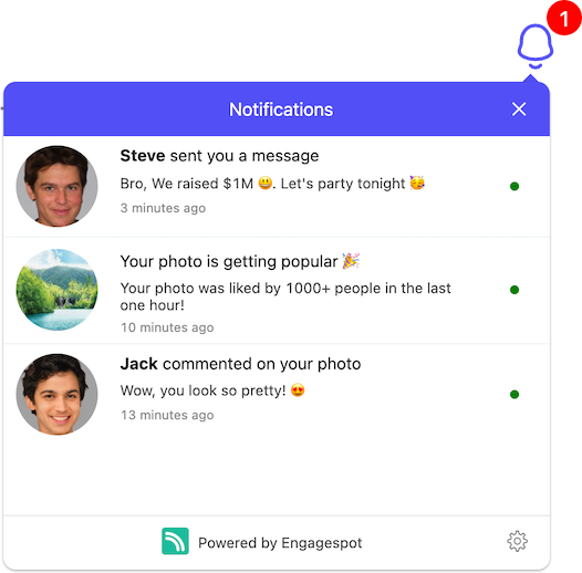
Something like this.
Quick Setup
You can add a notification feed to your Next.js app in minutes with the pre-built UI Components and APIs powered by Engagespot.
- npm
- yarn
- pnpm
npm install @engagespot/react-component
yarn add @engagespot/react-component
pnpm install @engagespot/react-component
Client Side Rendering
We need to render EngageSpot on the client. This process differs based on the type of Next.js router that your are using.
- App Router
You need to add 'use client' to the top of the file.
- Page Router
You need to import Engagespot Component using next/dynamic and disable pre-rendering. This is done by setting the ssr option to false.
Then render Engagespot component where you want the bell icon to appear.
- App Router
- Page Router
// EngageSpotNotification.tsx
'use client';

import { Engagespot } from '@engagespot/react-component';

const EngageSpotNotification = () => {
  return (
    <Engagespot
      apiKey="ENGAGESPOT_API_KEY"
      userId="unique-id-of-your-user"
      userToken="Required if secure auth is enabled on your Engagespot app"
    />
  );
};

// import and call the component where you want bell icon to appear
import EngageSpotNotification from './EngageSpotNotification';

return <EngageSpotNotification />;
// EngageSpotNotification.tsx
import { Engagespot } from '@engagespot/react-component';

const EngageSpotNotification = () => {
  return (
    <Engagespot
      apiKey="ENGAGESPOT_API_KEY"
      userId="unique-id-of-your-user"
      userToken="Required if secure auth is enabled on your Engagespot app"
    />
  );
};

// import and call the component where you want bell icon to appear
const EngageSpotNotification = dynamic(
  () => import('./EngageSpotNotification'),
  {
    ssr: false,
  },
);

return <EngageSpotNotification />;
You can find your ENGAGESPOT_API_KEY from your Engagespot dashboard.
What is userId?
As explained in the basic concepts chapter, userId should be any value to uniquely identify your app's users. It can be their email id, or UUID or a numerical id from your database. This value usually comes from your backend.
What is userToken?
The userToken is a token (JWT) generated for your users by your secure backend server using a secret private key generated from Engagespot console. This ensures secure authentication for your user's In-App inbox. Find more details on generating the userToken here.
You must enable secure authentication mode for your production apps; otherwise, unauthorized access to your users' inbox messages is possible.
Working with Actionable Elements
Engagespot In-App Inbox supports interactive notifications with buttons and input fields. You can choose the layout while creating a template from the Engagespot Console.
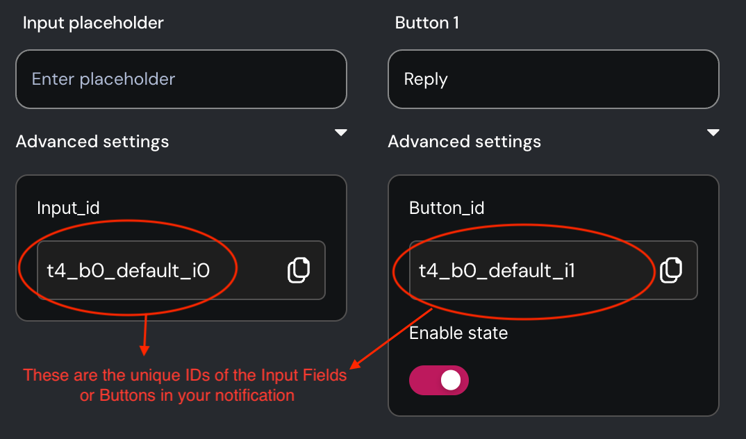
Unique ID of interactive element
Every interactive element, like buttons and input fields, is assigned a unique block ID. You can locate this block ID within your template editor. It's crucial to have this block ID when writing event listeners for the respective elements.
Writing Event Listeners for Actionable Elements
Use the eventListenersToRun property of Engagespot component to define event listeners for any block.
eventListenersToRun={[
  {
    blockId: "<blockId>",
    event: "<supportedEvent>",
    onEvent: ({ event, changeNotificationState, getValue }) => {
      /**
       * For input components, you can read their value
       * using `getValue()` function.
       */
      const comment = getValue("t101_b0_default_i0");

      /**
       * Change the state of notification
       * using `changeNotificationState()` method
       */
      changeNotificationState({ state: "accept" });
    },
  },
]}
Supported Events
| Block Type | Event | Description |
|---|---|---|
| Button | onClick | Fires when button is clicked |
| Input | onChange | Fires when value is changed |
| Input | onKeyDown / onKeyUp | Fires when a key is pressed / released |
Notification Events
You can listen to specific notification events, such as Notification Received, Seen, Read, Deleted, etc., and execute custom logic in your frontend code. Utilize the events property of the Engagespot component for this purpose.
<Engagespot
  userId="<userId>"
  apiKey="<apiKey>"
  events={{
    onNotificationReceive: notification => {},
  }}
/>
Extending Components
Engagespot Next.js library allows you to customize the pre-built UI components to match your needs and requirements. Let's look at few customization options available.
Rendering a custom notification item
A notification item is an individual notification component in the notification center. You can completely customize it using the renderNotificationBody property which accepts a call back function with the notification item. The function should return a custom Next.js component which will be rendered instead of the default notification item component.
For example, you can render a custom notification item like the one below -
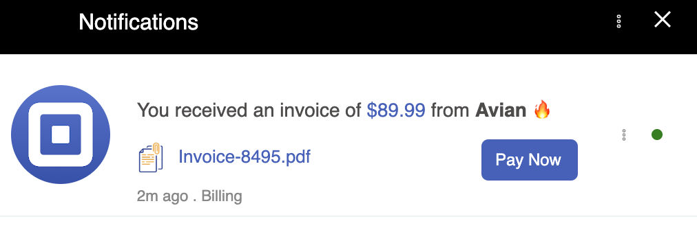
Sample code for rendering a custom notification item using the renderNotificationBody prop is shown below.
<Engagespot
  apiKey="tcyj57u29ferlgqt58qcl"
  userId="user@codesanbox.io"
  feedItemPlaceholderImage="https://cdn.iconscout.com/icon/premium/png-256-thumb/notification-165-723675.png"
  theme={theme}
  renderNotificationBody={notification => {
    if (notification.data?.type === 'invoice') {
      return (
        <>
          <h5
            style={{
              fontSize: '14px',
              padding: '0px',
              color: '#4f4b4b',
              marginBottom: '2px',
              fontWeight: 'normal',
              fontSize: '14px',
            }}
            dangerouslySetInnerHTML={{ __html: notification.heading }}
          ></h5>

          <div>
            <div style={{ width: '15%', float: 'left' }}>
              <img
                style={{
                  marginLeft: '-10px',
                  width: '80%',
                  borderRadius: '5px',
                  paddingTop: '8px',
                }}
                src={notification.data.attachmentIcon}
                alt="icon"
              />
            </div>
            <div
              style={{
                width: '50%',
                float: 'left',
                marginLeft: '-20px',

                paddingTop: '15px',
                fontSize: '13px',
              }}
            >
              <a
                style={{ textDecoration: 'none', color: '#3f62be' }}
                href={notification.data.downloadUrl}
              >
                {notification.data.filename}
              </a>
            </div>
            <div
              class="actionItems"
              style={{
                width: '25%',
                float: 'right',
                paddingTop: '10px',
                fontSize: '14px',
              }}
            >
              <a
                href="#"
                style={{
                  width: '50px',
                  borderRadius: '5px',
                  display: 'block',
                  backgroundColor: '#3f62be',
                  color: '#fff',
                  textDecoration: 'none',
                  padding: '8px 10px',
                  fontSize: '12px',
                  marginBottom: '5px',
                }}
              >
                Pay Now
              </a>
            </div>
          </div>

          <div>
            <p style={{ fontSize: '0.7rem', color: 'rgb(136, 136, 136)' }}>
              2m ago . Billing
            </p>
          </div>
        </>
      );
    }
  }}
/>
Props
The Engagespot notification react component can be customized to suit your application's look and feel. The Engagespot component accepts the following props (EngagespotProps interface).
EngagespotProps
interface EngagespotProps {
  theme?: ThemeOverrides;
  panelOpenByDefault?: boolean;
  panelOnly?: boolean;
  feedItemPlaceholderImage?: string;
  hideNotificationAvatar?: boolean;
  hideJumpToTop?: boolean;
  headerText?: string;
  renderFooterContent?: customRenderFn;
  renderNotificationIcon?: customRenderFn;
  renderEmptyPlaceholderImage?: customRenderFn;
  renderNotificationContent?: customRenderFn<customNotificationContentType>;
  renderNotificationBody?: customRenderFn<customNotificationContentType>;
  onFeedItemClick?: (evt, payload: ClickableNotificationPayload) => void;
  headerDropdownItems?: DropdownMenuProps["items"];
};
ThemeOverrides
The theme parameter is of ThemeOverrides interface. You can customize pretty much every element of your notification center.
interface ThemeOverrides {

    colors: {
        brandingPrimary: string;
        colorPrimary: string;
        colorSecondary: string;
    };
    panel: {
        boxShadow: string;
        width: string;
        height: string;
        borderBottomLeftRadius: string;
        borderBottomRightRadius: string;
        borderTopLeftRadius: string;
        borderTopRightRadius: string;
        arrowSize: string;
        arrowInset: string;
    };
    feed: {
        background: string;
        placeholderTextColor: string;
        height: string;
        placeholderTextSize: string;
        placeholderMargin: string;
        placeholderFontWeight: string;
    };
    feedItem: {
        border: string;
        background: string;
        notificationDot: string;
        hoverBackground: string;
        headerColor: string;
        descriptionColor: string;
        dateColor: string;
        placeHolderBackground: string;
        placeHolderGradient: string;
        height: string;
        padding: string;
        placeholderTextSize: string;
        notificationDotSize: string;
        imageSize: string;
        imageRadius: string;
        hoverTransition: string;
        textContentPadding: string;
        textContentMargin: string;
        headerFontWeight: string;
        headerSize: string;
        headerPadding: string;
        descriptionSize: string;
        descriptionPadding: string;
        dateSize: string;
        menuMargin: string;
    };
    notificationButton: {
        background: string;
        hoverBackground: string;
        iconFill: string;
        floatingButtonShadow: string;
        iconSize: string;
        outline: string;
        margin: string;
        padding: string;
        borderWidth: string;
        normalButtonRadius: string;
        floatingButtonRadius: string;
        transition: string;
    };
    unreadBadgeCount: {
        background: string;
        color: string;
        borderRadius: string;
        fontSize: string;
        inset: string;
        size: string;
    };
    dropdown: {
        iconFill: string;
        background: string;
        hoverBackground: string;
        menuBackground: string;
        menuShadow: string;
        menuItemTextColor: string;
        menuItemHoverBackground: string;
        iconWidth: string;
        iconHeight: string;
        margin: string;
        padding: string;
        borderWidth: string;
        outline: string;
        transition: string;
        menuBorderRadius: string;
        menuItemPadding: string;
    };
    jumpToTop: {
        background: string;
        iconFill: string;
        shadow: string;
        iconSize: string;
        inset: string;
        borderRadius: string;
        padding: string;
        margin: string;
        transition: string;
    };
    header: {
        fontColor: string;
        closeButtonBackground: string;
        fontSize: string;
        fontWeight: string;
        height: string;
        padding: string;
        closeButtonOutline: string;
        closeButtonPadding: string;
        closeButtonFontSize: string;
        closeButtonMargin: string;
        closeButtonColor: string;
    };
    footer: {
        background: string;
        fontColor: string;
        preferenceButtonColor: string;
        border: string;
        preferenceButtonHoverBackground: string;
        fontWeight: string;
        height: string;
        padding: string;
        fontSize: string;
        linkMargin: string;
        linkSize: string;
        preferenceButtonMargin: string;
        preferenceButtonSize: string;
        preferenceButtonPadding: string;
        preferenceButtonHoverTransition: string;
        linkRadius: string;
    };
    preference: {
        fontColor: string;
        background: string;
        height: string;
        fontWeight: string;
        padding: string;
    };
    preferenceModal: {
        overlayBackground: string;
        headingColor: string;
        background: string;
        closeButtonColor: string;
        textPrimaryColor: string;
        textSecondaryColor: string;
        buttonPrimaryColor: string;
        buttonPrimaryBackgroundColor: string;
        buttonPrimaryHoverBackgroundColor: string;
        buttonSecondaryColor: string;
        buttonSecondaryBackgroundColor: string;
        buttonSecondaryHoverBackgroundColor: string;
        overlayOpacity: string;
        height: string;
        backdropFilter: string;
        borderRadius: string;
        padding: string;
        textAlign: string;
        headerMargin: string;
        headerFontSize: string;
        closeButtonSize: string;
        textPrimaryMargin: string;
        textPrimaryFontSize: string;
        textSecondaryMargin: string;
        textSecondaryFontSize: string;
        primaryButtonFontWeight: string;
        primaryButtonPadding: string;
        primaryButtonBorderRadius: string;
        primaryButtonMargin: string;
        primaryButtonTransition: string;
    }
}
For example, if you want to change the primary colors of your notification feed,
import {Engagespot} from '@engagespot/react-component';

const theme = {
    colors: {
        colorPrimary: "#0971f1";
    }
}

<Engagespot
  apiKey = "ENGAGESPOT_API_KEY"
  userId = "youruser@example.com"
  theme = {theme}
/>
You can check out examples in Codesandbox to learn how to customize different elements of the notification inbox component.